Landing Page & Web App
Client
Kirim Uang
Understanding the Terrain
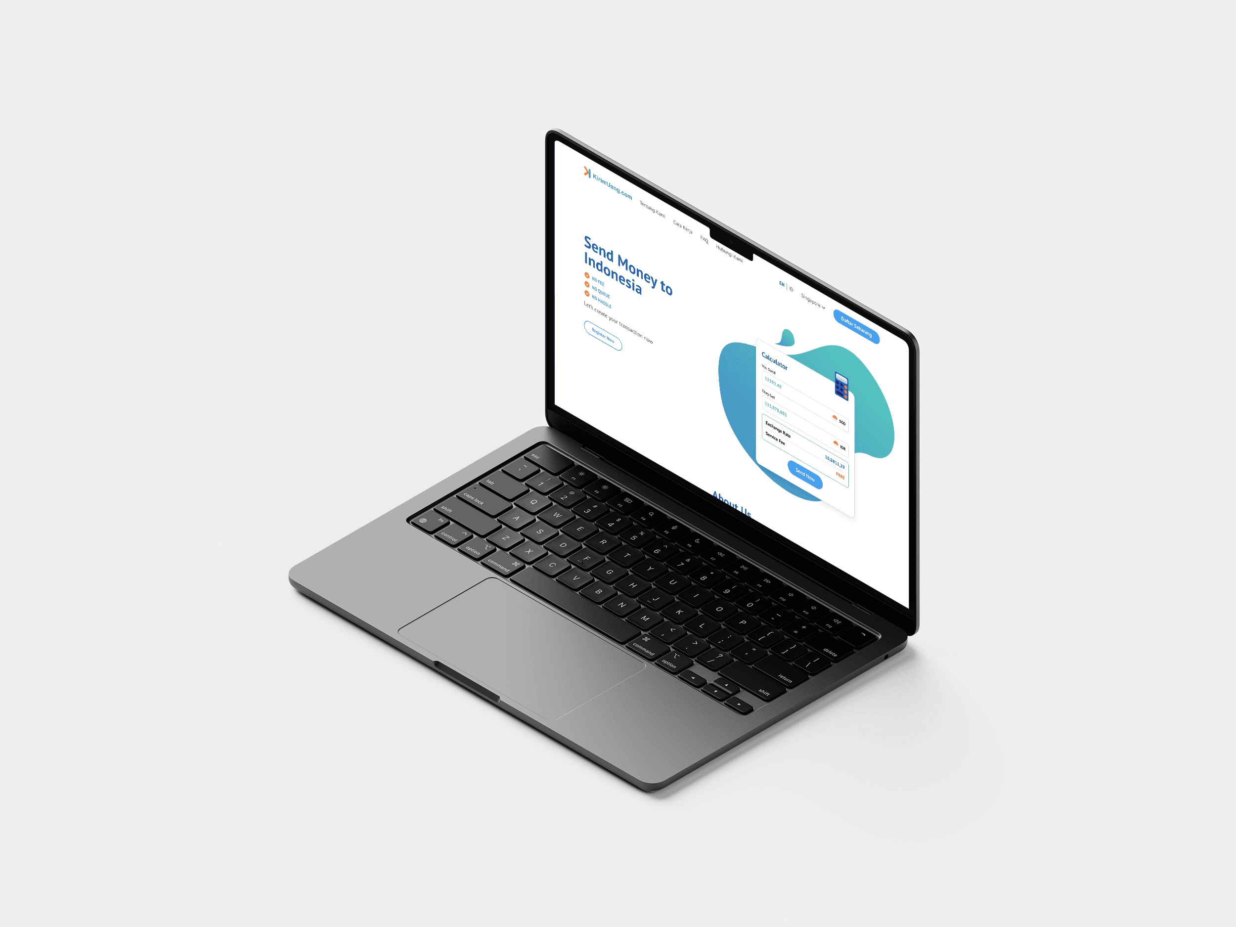
Kirim Uang facilitates money transfers between Singapore and Indonesia through its mobile applications. As user needs evolved and the importance of multi-platform accessibility grew, a strategic decision was made to transition Kirim Uang from a mobile-only service to a comprehensive, responsive web application.
My task in this project was to transform Kirim Uang's mobile experience into a seamless web application. This project appeared straightforward but required careful consideration of several factors. It was essential to enable money transfers not only from Singapore to Indonesia but also in the opposite direction. Various dependencies were tied to the sender's country. For instance, legal regulations differed, with the Monetary Authority of Singapore governing transactions from Singapore and Bank Indonesia overseeing those from Indonesia.
Challenges
Transformed Kirim Uang's mobile-only money transfer service into a comprehensive, responsive web application.
Adapted the user experience for web platforms while maintaining brand consistency.
Addressed country-specific regulatory requirements.
Solutions
Conducted thorough analysis of the existing mobile app to create a comprehensive web architecture.
Redesigned key elements
Implemented multi-language support
Collaborated closely with developers to address mobile interaction challenges on web
Designing the Blueprint
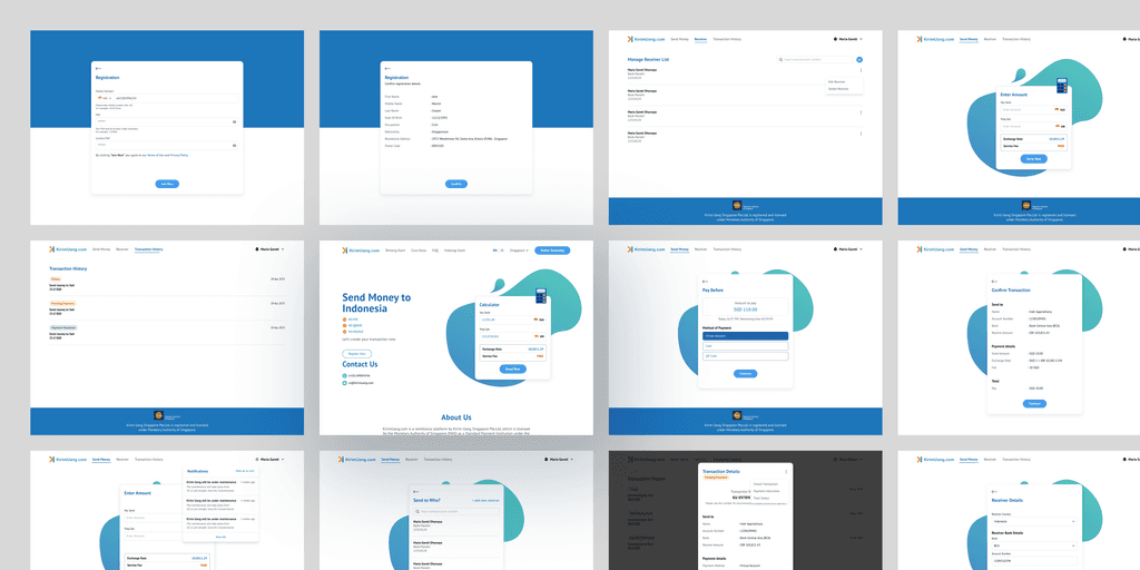
The project began with an in-depth analysis of the existing mobile app, presented by the client through Google Slides. I revisited the presentation and created an architecture based on what was presented. This process helped identify features that were not detailed in the Google Slides presentation and ensured that no states or features were missed during development.
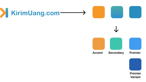
With confidence in the information gathered, I started the redesign process. The absence of established brand guidelines posed a challenge, as I was concerned about potentially altering colors or choosing incorrect combinations. I meticulously extracted the primary and secondary color palettes from the logo (Figure 1.0), making tweaks to finalize the colors while maintaining similarity to the mobile app. Additionally, I preserved the typography and stylistic elements to retain the app's identity.
Fig 1.0 Color Extraction
The redesign files were structured based on the country and language, followed by several improvements during the process:
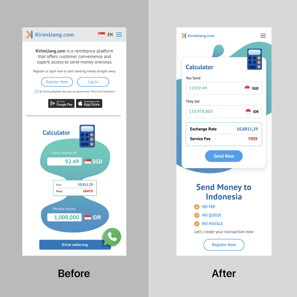
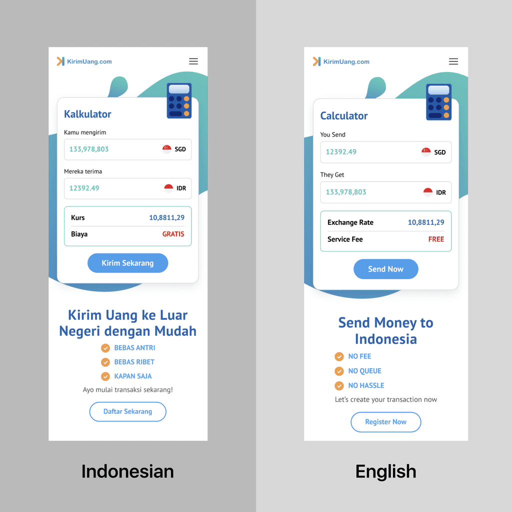
Calculator Redesign: Redesigned the calculator (Figure 2.0) to keep the original vibe while enhancing usability. This included simplifying the layout, improving button responsiveness, and ensuring consistency with the overall design language.
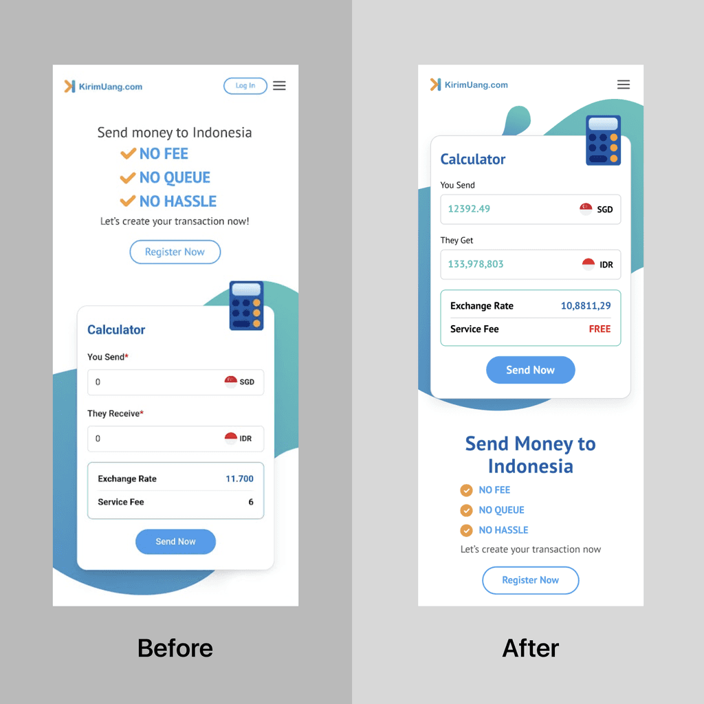
Typography Enhancement: Improved the clarity of typography (Figure 2.1) by selecting more legible fonts and optimizing font sizes and weights for better readability across different devices.
Screen Completion: Completed screens that were not detailed in the Google Slides. This involved filling in missing elements, ensuring consistency with the overall design, and aligning with user expectations.
Translation: Translated (Figure 2.2) all the pages into Indonesian to ensure accessibility for the target audience.
We kept the client updated with any changes and asked for feedback during the design process. Detailed language and design elements were extensively reviewed on Figma to keep the client in the loop throughout the process.
Fig 2.0 Calculator Redesign
Fig 2.1 Typography Enhancement
Fig 2.2 Translation
Development Forge
We conducted daily updates to ensure seamless communication between each role during development. Although all designs were completed before development began, some iterations and additional feedback occurred during development. My role during this phase was to ensure that any additions were consistent with the current design and to address limitations if changes were not possible due to technical or time constraints. Additionally, I needed to verify that the developed design met the minimum accepted standards.
This project presented numerous challenges, particularly in addressing suboptimal mobile interactions. Another significant consideration was maintaining consistency with the current design, given that the development was limited to the front end while the back end was managed by another party. Adding new features or reinventing existing ones that related to the back end could take considerable time and potentially require further development from our side.
Fig 3.0 Design Preview
One example of suboptimal mobile interactions was the dropdown menu for selecting a country, which did not work as the client expected when accessed on mobile devices. Initially, we proposed adding a search functionality to the dropdown to make it easier for users to select a country from the extensive list of options. However, the client preferred to prioritize countries like Singapore and Indonesia in the dropdown menu. Recognizing the practicality of their request, we communicated with the engineers to explore the feasibility of implementing this change.
Adding a search functionality to the dropdown would enhance user experience by allowing quick access to desired options, especially in cases with numerous selections. However, prioritizing key countries as suggested by the client also makes sense as it aligns with the primary use cases of the app. By effectively communicating with the engineering team, we were able to balance user experience improvements with practical development considerations, ensuring the final product met both user needs and client expectations.
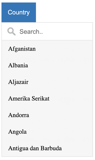
Fig 4.0 Sample Dropdown
with Search
Launch and Beyond
The final launch of the Kirim Uang web application marks a significant milestone, where the project achieved its intended functionality and performed well.
Reflecting on this project, I've learned invaluable lessons about the importance of detail-oriented design and adaptive problem-solving. Throughout the process, maintaining a user-centric focus was crucial. Collaborating closely with developers and stakeholders emphasized the critical role of communication and flexibility in translating design concepts into functional realities. We continually solicited feedback from users and stakeholders to ensure that our design decisions aligned with their needs and expectations.
