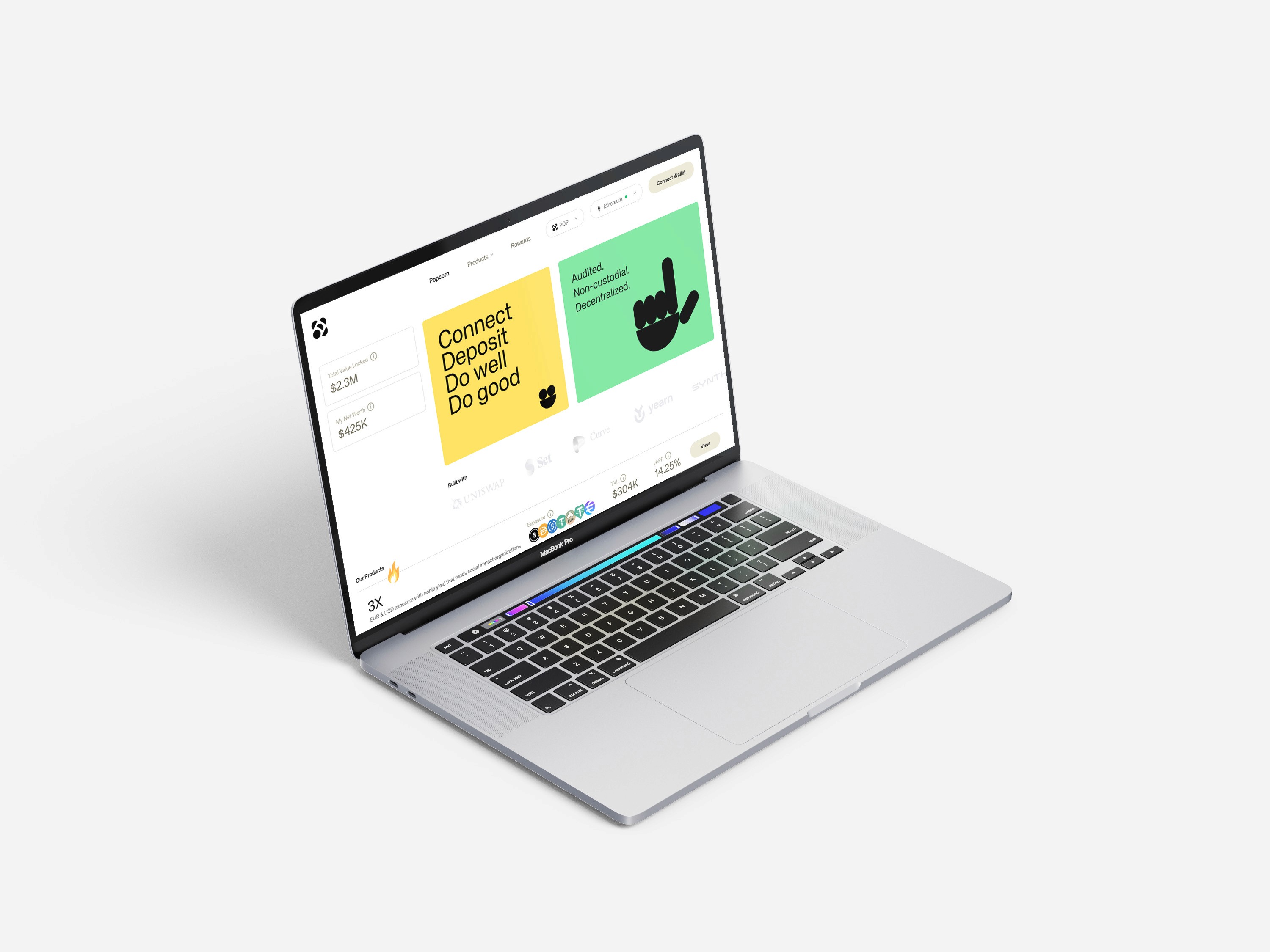
Landing Page & Web App
Client
Popcorn
Overview
Popcorn is a digital platform in decentralized finance (DeFi) that supports social good by providing grants to community-selected beneficiaries. This approach encourages financial inclusion and nurtures a community-driven environment focused on social impact and sustainability.
In my role, I designed the website and app for Popcorn. The app includes various features such as product offerings, staking options, and reward systems.
Landing Page
I worked on landing pages across three phases: introducing the Popcorn project, announcing the product launch, and rebranding Popcorn.
First Phase :
Introducing the Popcorn Project
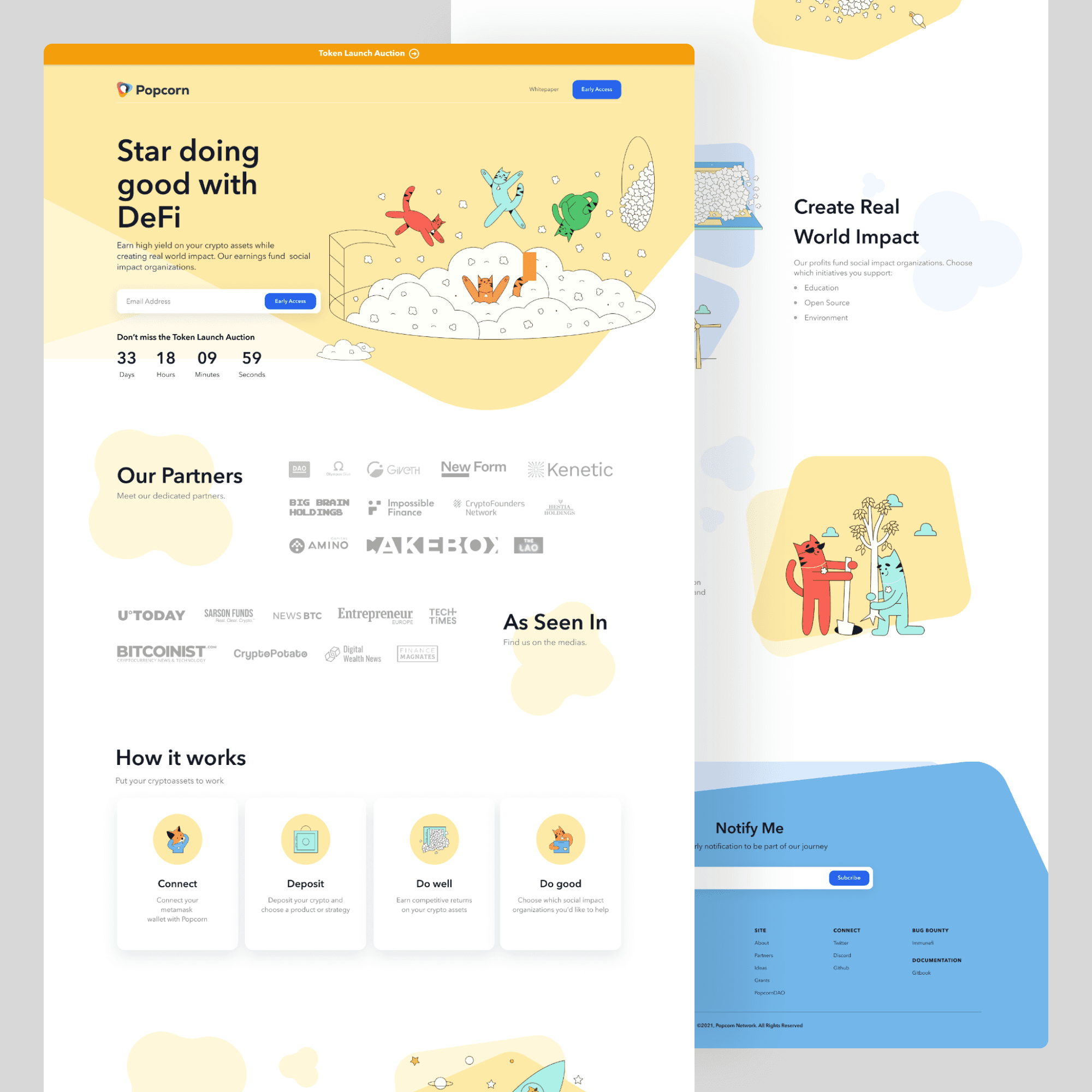
In the initial landing page phase, my objective was to present the Popcorn product engagingly and playfully. The design captured the brand's adorable and friendly character, infused with a touch of whimsy. Using a soothing palette of smooth yellow and soft blue, I established an inviting visual atmosphere.
To craft a lasting user experience, I seamlessly integrated charming elements like cute cats and popcorn throughout the page. These features not only mirrored the brand's identity but also contributed to a sense of enjoyment and approachability.
Fig 1.0 Landing Page
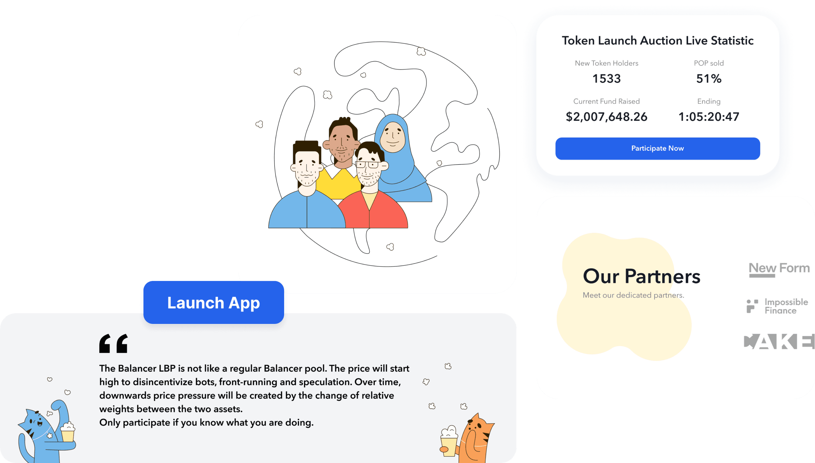
Fig 1.1 Additional Feature
Second Phase :
Announcing Product Launch
In the second phase, we enhanced the landing page with a user-friendly button for direct app access. We also included reminders and links to partner events to keep users informed.
Third Phase :
Redesigning with new brand
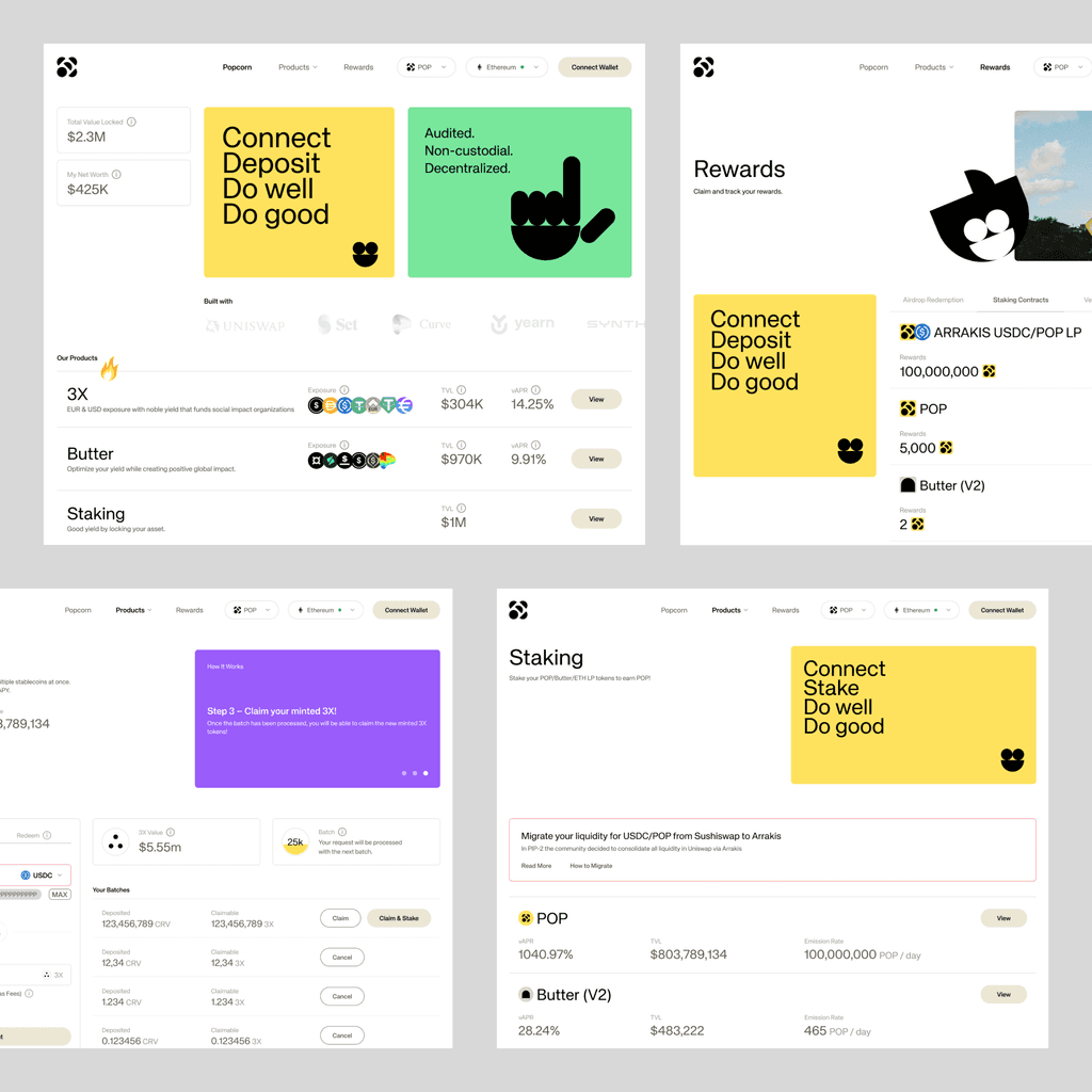
The final aspect I participated in within this project was the redesign phase. The entire brand underwent a transformation, adopting a more serious and bold visual identity while incorporating a refined color scheme.Following the guidance of the agency that spearheaded the brand redesign, we embraced a "magazine look" layout. This involved integrating bold and larger fonts, creating dynamic spacing imbalances, and allowing for more generous white space.
The design elements from the previous phases underwent a geometric makeover, departing from the previous cute style. This transition allowed for a more precise representation of section contexts. For example, the "do well" element, which communicates Popcorn's return optimization, is now portrayed with a smile shape, a combination of a circle and a half-circle. Moreover, we effectively highlighted the product within the landing page to ensure its prominence.
Fig 1.2 Before & After Landing Page
Web App - Sweet Caramel
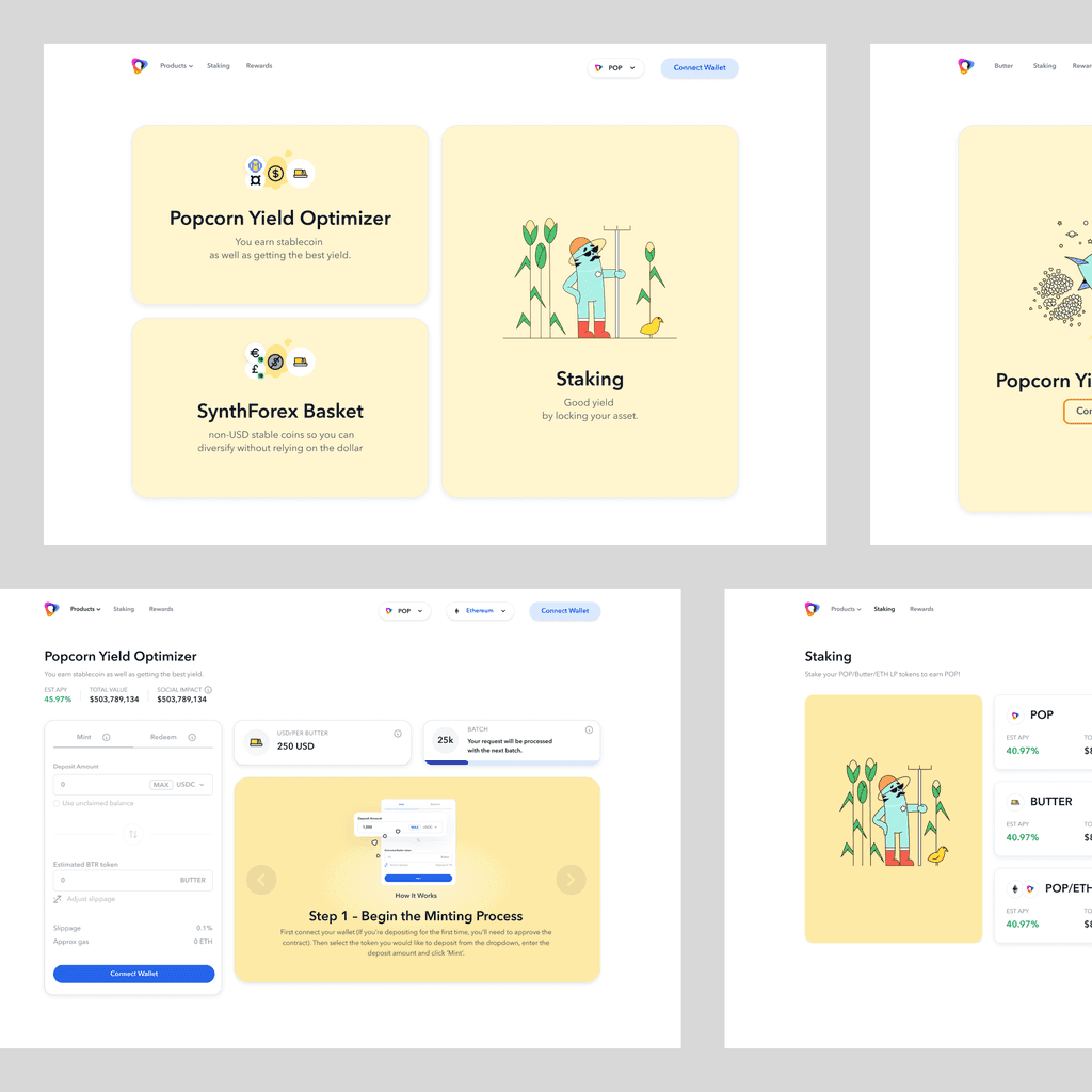
The next task I worked on is a product called "Sweet Caramel." This app includes several features: 3x yield optimizer, stacking, and rewards. Essentially, it enables users to mint/stack tokens, redeem tokens, and receive rewards, providing a comprehensive financial ecosystem.
I focused on detailing the "what," "how," and "why" of user actions for each feature. This approach is critical, as it directly impacts users' financial decisions. By clearly explaining what each feature does, how users can interact with it, and why these actions are beneficial, I aimed to give users a thorough understanding. This empowerment allows users to make informed choices about their financial activities within the Sweet Caramel ecosystem.
Additionally, we applied redesigned branding to the product. While the core information remained the same, the new branding introduced a fresh and distinct look and feel, enhancing user engagement and the overall experience.
Fig 2.0 App Before Redesign
Fig 2.1 App After Redesign
